Writing

Store teardowns from Dee2See, essays from Medium, and everything else I can't stop writing about eCommerce.

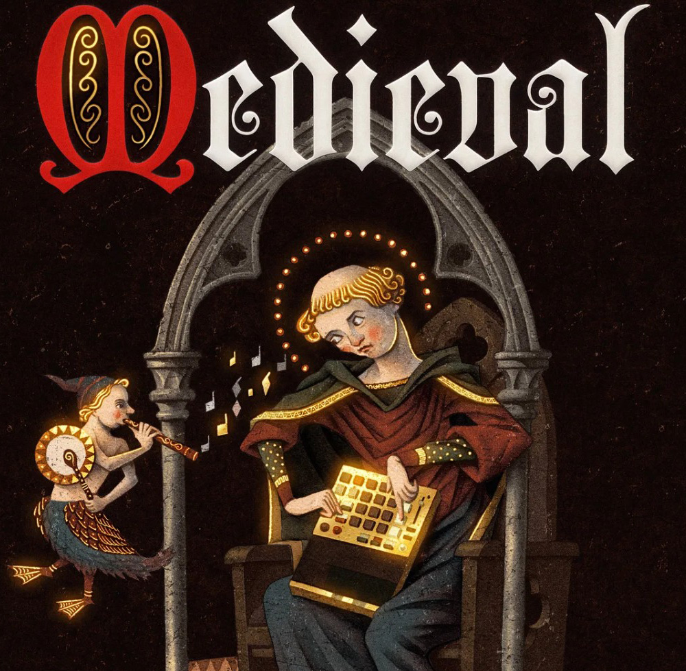
seated figure playing the sampler under a gothic arch, goat-legged bard playing a flute beside them.

Oh Deus Meus! – Teenage Engineering

Teenage Engineering doesn't reskin its product pages, it rewrites them. Every EP-series unit gets its own vocabulary down to the button labels, the explore and buy pages split into two separate journeys, and the firmware changelog ships as an illustrated comic strip.

Published on Dee2See - August 2026

  • electronics
  • brand
  • trust
  • storytelling
  • visuals
  • copy
Continue Reading
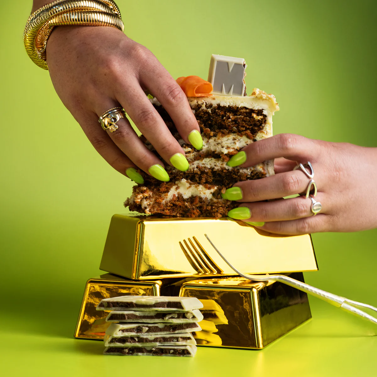
woman's hands with pistacchio green nail polish holding a piece of layered cake on a stack of gold bars

Wrapper's Delight: Maeven Chocolate

A chocolate store with no product above the fold. How Maeve turns curiosity into a discovery engine, and why great branding alone never gets you there.

Published on Dee2See - August 2026

  • delight
  • food
Continue Reading
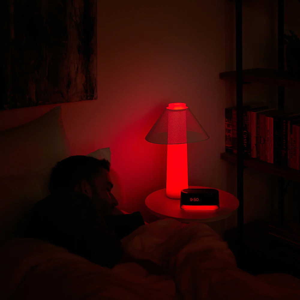
Person sleeping in bed beside a red-lit Loftie lamp and clock reading 9:50, in a dark bedroom.

Sleeping On It: Loftie

Sleep deprivation is the worst, and Loftie’s whole site seems to know it. Dark photography, toggles that let you confirm a claim yourself, and a return policy pun good enough to make you smile at the fine print.

Published on Dee2See - July 2026

  • lifestyle
  • trust
  • microcopy
Continue Reading
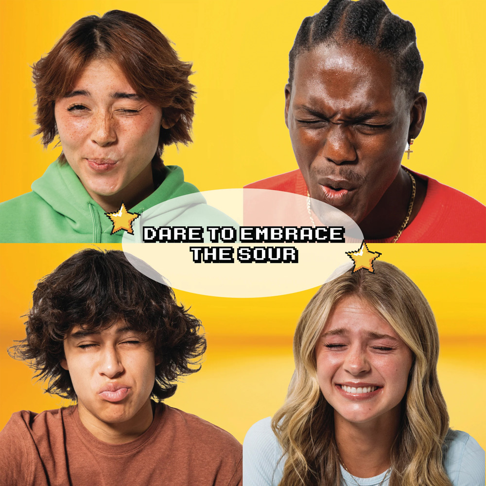
Four people react to a sour candy, faces scrunched, next to "Dare to Embrace the Sour" text. Final Boss Sour campaign imagery.

Why The Sour Face?: Final Boss Sour

Final Boss Sour didn’t add a game theme to a candy site. It built an actual game, levels as navigation, lore as flavor differentiation, a map with unfinished paths, and a leaderboard, then hung a sour candy brand off the structure.

Published on Dee2See - July 2026

  • food
  • gamification
Continue Reading
Man wearing a telephone headset, smiling and holding a fan of cash bills

Sound Expensive

How a comma and two decimal places change what your customer thinks your product costs

Published on Medium - July 2026

  • ecommerce ux
  • pricing psychology
Continue Reading
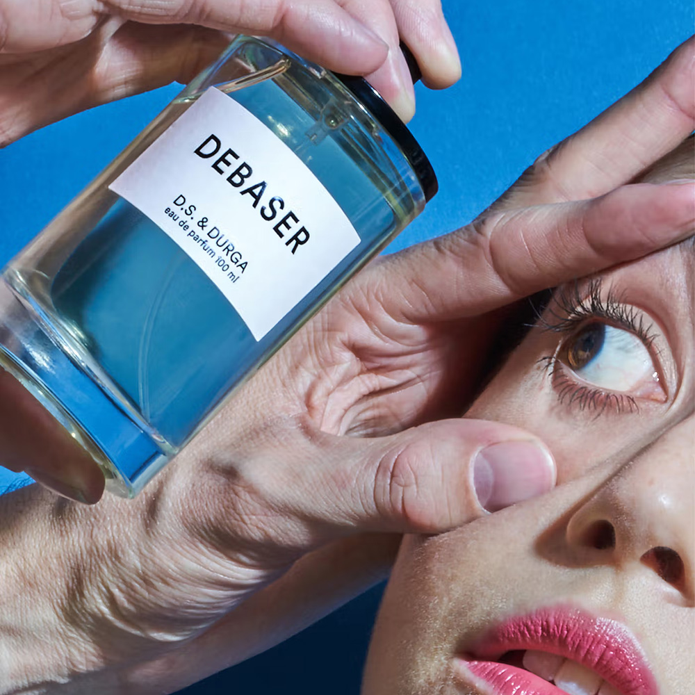
D.S. & Durga "Debaser" perfume bottle held near a woman's face

Play It By The Nose: D.S & Durga

You cannot smell a website, and D.S. & Durga barely tries to solve that. The Brooklyn perfume house routes around the missing sense instead, with a notes rail that works like a spec sheet, liner notes written as autobiography, a Spotify playlist per fragrance, and a layering set that is essentially Clue with bottles.

Published on Dee2See - July 2026

  • lifestyle
  • perfume
  • senses
Continue Reading
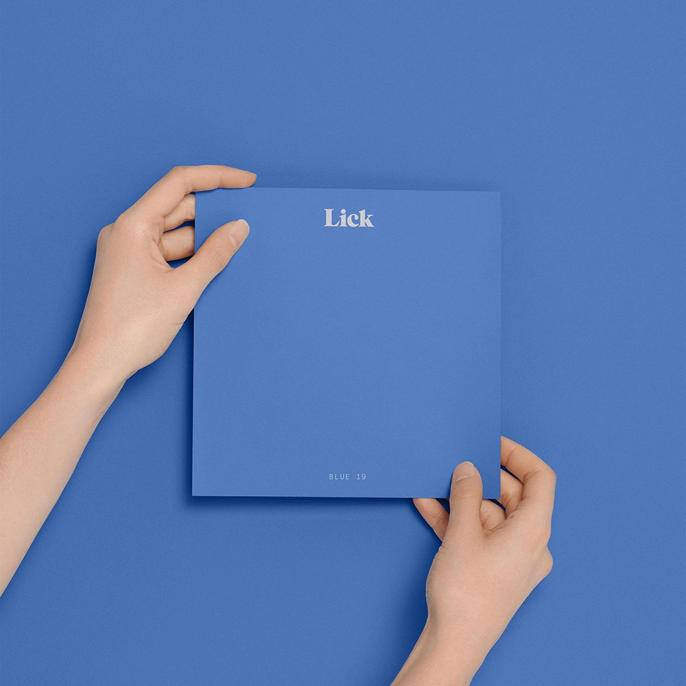
Two hands holding a Lick paint sample card in "Blue 19," matching the blue background.

I Love Hue: Lick

Buying paint online should be a commercial disaster. Color distortion, choice paralysis, spatial math anxiety, the fear of getting it completely wrong on your own walls. Lick.com looked at every one of those friction points and built a system to dismantle them, one screen at a time.

Published on Dee2See - June 2026

  • home & living
  • decor
  • microcopy
Continue Reading
Two men sitting on a couch with a Rottweiler, a wire-haired terrier mix, and a framed photo of a puppy in a bag on the wall behind them.

Best Onboarding EVER: The Farmer's Dog

There's a moment somewhere in The Farmer's Dog onboarding where you realize you've completely stopped resisting (in a good way). This is a screen-by-screen breakdown of how they did it, and why making the wizard about your dog instead of about you is the smartest conversion move in the flow.

Published on Dee2See - June 2026

  • pets
  • onboarding
Continue Reading
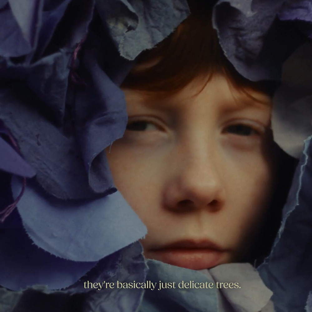
Close-up of a child's face peeking through folds of blue fabric, with the text "they're basically just delicate trees." at the bottom.

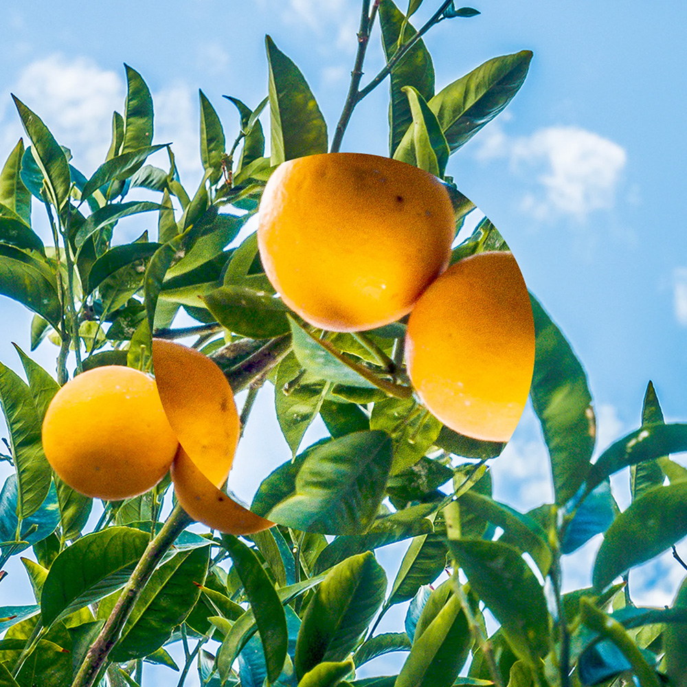
When Life Gives You Oranges: Ffern

Ffern makes one seasonal perfume four times a year. There is no product page, no add to cart, and no conventional funnel. Just a ledger, a waiting list, and a buying experience built entirely around the privilege of being let in.

Published on Dee2See - June 2026

  • loyalty
  • perfume
  • senses
Continue Reading
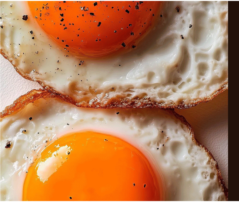
close up on sunny side up eggs, view from above

Bite-Size UX, Week #1

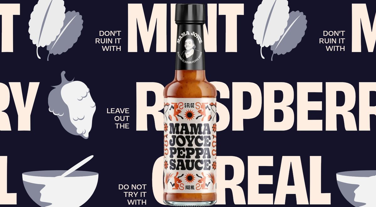
Four DTC brands that sweated the small stuff and got it right. A color-coded pepper store, a discount that stays in character, a honey disclaimer with a punchline, and a glass that fills as you scroll.

Published on Dee2See - June 2026

  • ecommerce ux
Continue Reading
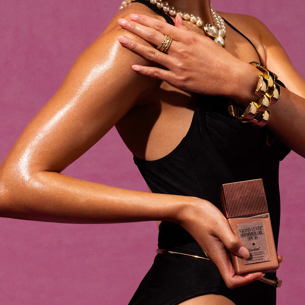
Woman in a black swimsuit with pearl jewelry, shimmering skin, holding Vacation Grand Cuvee Shimmer Oil SPF 30 against a pink background

For the Next Magic I'll Need SPF 30 and a Time Machine: Vacation.inc

Vacation® sells sunscreen. Their website sells a world. Every ecommerce best practice is there, structurally intact, dressed in a Miami Beach 1983 aesthetic so committed that the conventions become invisible. This is what it looks like when personality and conversion are the same thing.

Published on Dee2See - June 2026

  • lifestyle
  • storytelling
  • wellness
Continue Reading
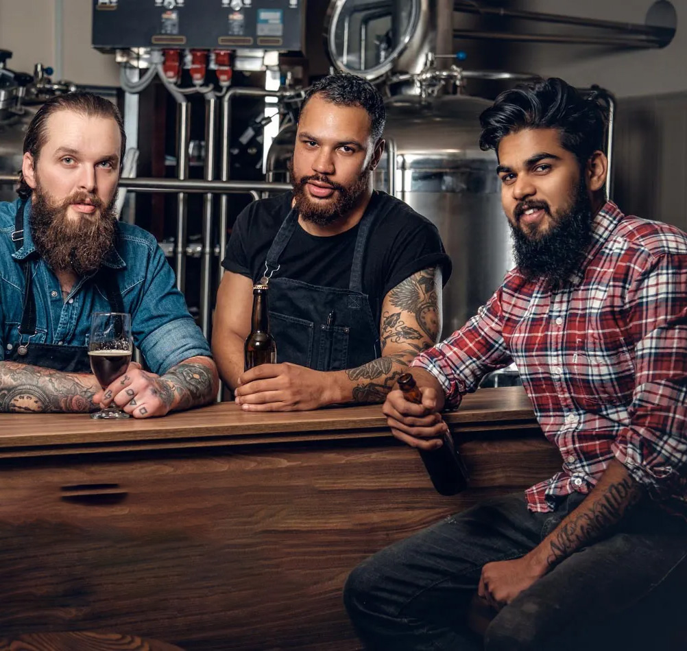
Three bearded brewers with beers and tattoos leaning on a wooden bar in front of brewing equipment.

Three Audiences Walked Into a Product Page

Open a DTC health or wellness product page in 2026 and you'll likely scroll for what feels like five minutes before hitting the footer. Who are your target audiences now that the AI engines are here, and how to cater to each one of them (including examples)

Published on Medium - June 2026

  • agentic commerce
  • PDP
Continue Reading
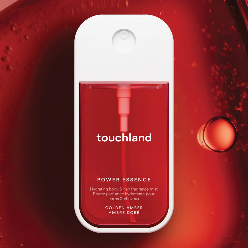
Touchland Power Essence hydrating body and hair fragrance mist, Golden Amber scent, in a red spray bottle against a red liquid background.

It Makes Scents: Touchland

Touchland didn't dress up a hand sanitizer with nicer packaging. They applied the entire information architecture of fine fragrance to a $10 product whose only job used to be killing germs. This is what full category commitment looks like.

Published on Dee2See - June 2026

  • sense
  • visual
Continue Reading
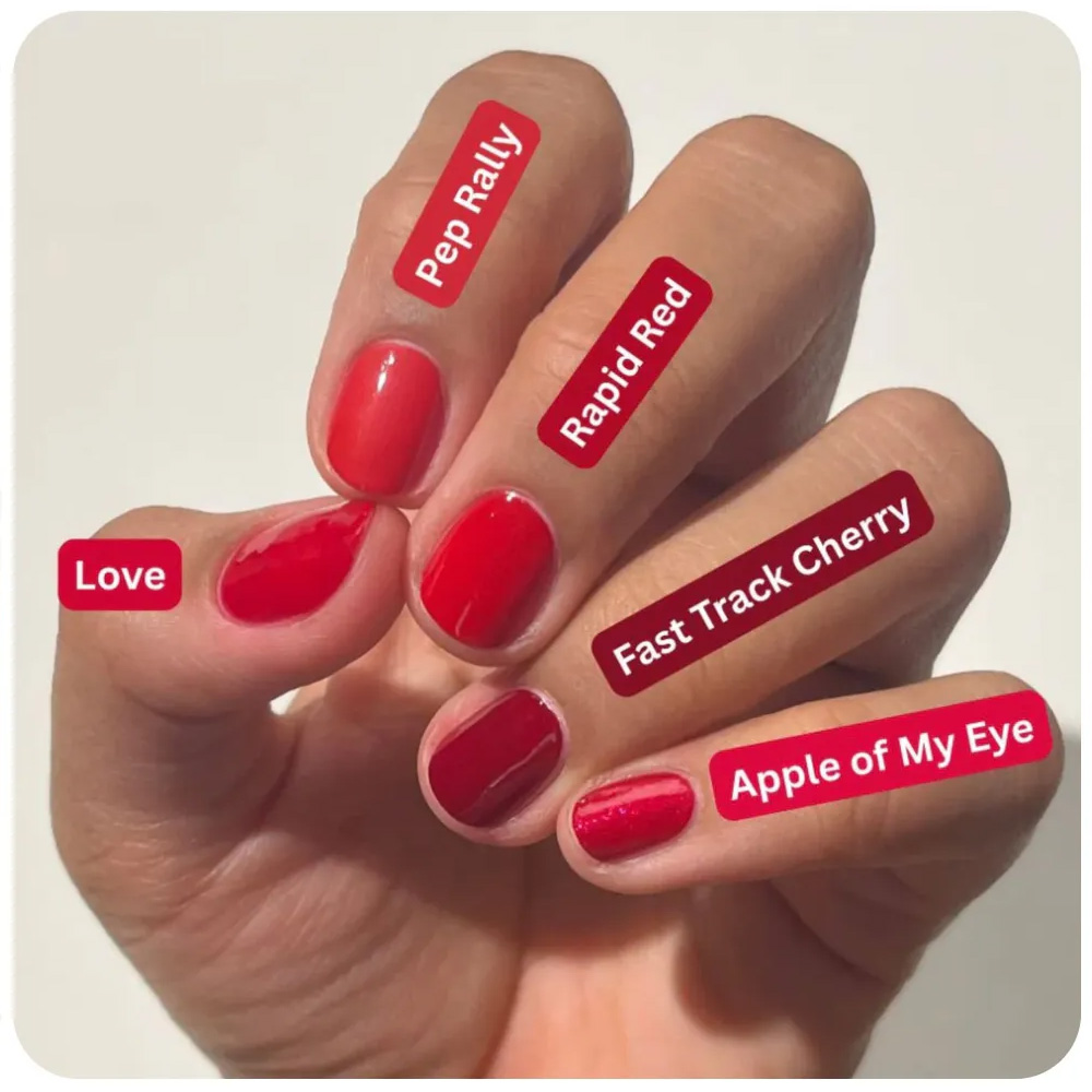
Hand with five different red nail polish shades labeled on each finger: Love, Pep Rally, Rapid Red, Fast Track Cherry, and Apple of My Eye.

Bite Size UX - Week #2

The difference between a site that converts and one that almost does is rarely a missing feature. It is usually a small decision someone made, or didn't.

Published on Dee2See - June 2026

  • ecommerce ux
Continue Reading
Woman with red hair shrugging with hands raised, wearing a mustard coat over a red sweater against a red background.

The Pattern Recognition Trap: Why New Packaging Kills Conversion (and How to Fix It)

New packaging shouldn't ambush loyal customers. A look at why sudden rebrands trigger "is this a knockoff?" panic, and how brands like Magic Spoon and John Frieda use side-by-side transition UI to keep the pattern recognition intact.

Published on Dee2See - May 2026

  • rebrand
  • ux
  • ecommerce ux
Continue Reading
Man in a blue and tan "Boston" tank top and running shorts standing on stairs, with a runner wrapped in a foil blanket in the background.

The Empathy Algorithm: Why Your AI is Creepy and Your UX is Boring

Walking into most eCommerce stores today feels like being followed around a physical shop by a robot that's trying too hard.

Published on Medium - May 2026

  • AI
  • personality
Continue Reading
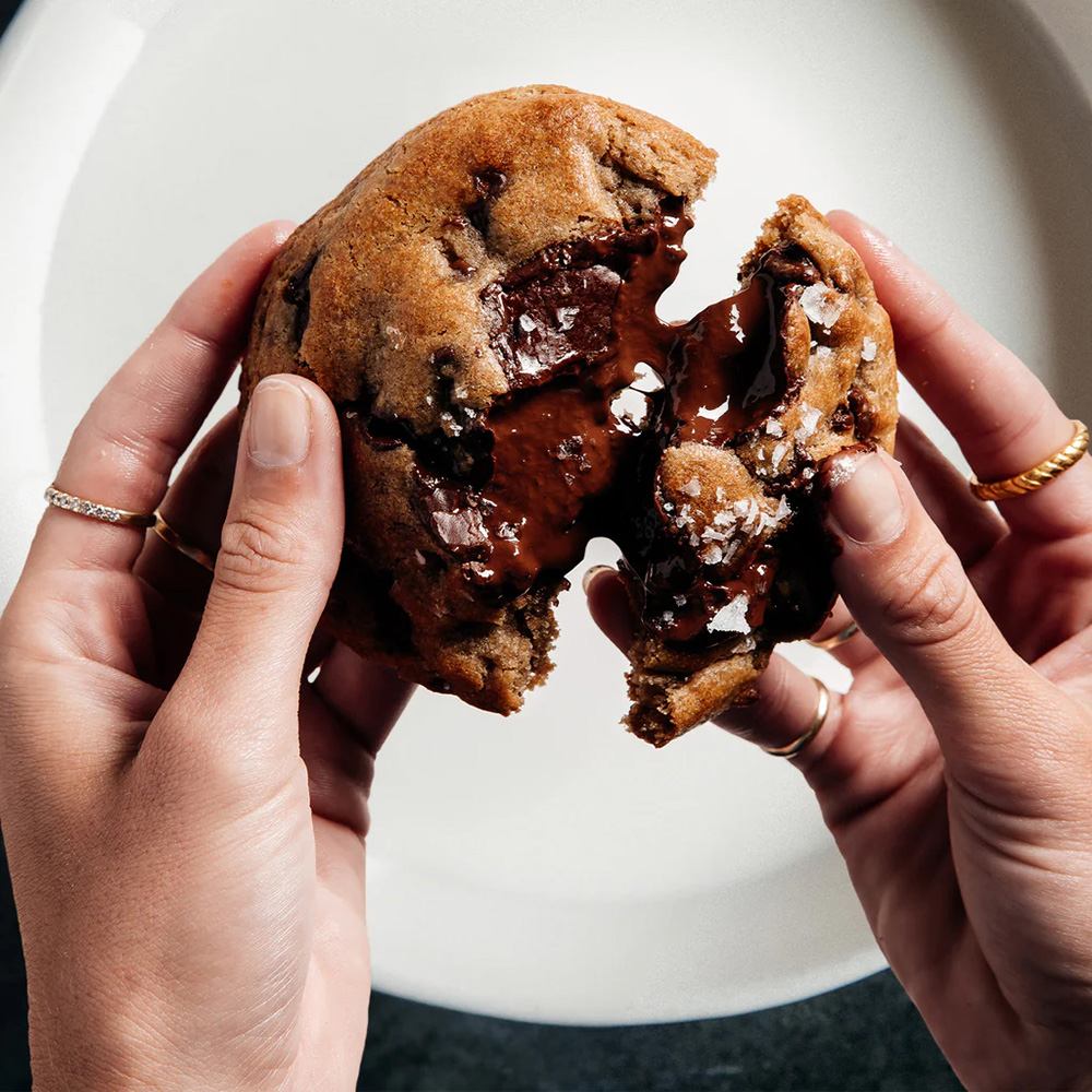
Two hands pulling apart a chocolate chip cookie, revealing melted chocolate and flaky sea salt inside.

Better Than S*x: Last Crumb

$160 for a box of cookies. A three-day wait. A CTA button that says Sorry, Grandma. By every CRO rule in the book, Last Crumb should fail. Instead they sell out in drops. Here's the conversion system hiding behind the audacity.

Published on Dee2See - May 2026

  • food
  • photography
  • luxury
Continue Reading
Shirtless man with extensive tattoos smiling, wearing black swim trunks with a colorful rooster print.

Behind the Seams: Chubbies

Most menswear brands optimize their product pages for polite, frictionless transactions. Chubbies optimized theirs for a subculture. The Khakinators. The Disco Plums. 110% store credit on resale. A palm tree tattoo that explains fit better than any size chart.

Published on Dee2See - May 2026

  • fashion
  • humor
  • size chart
Continue Reading
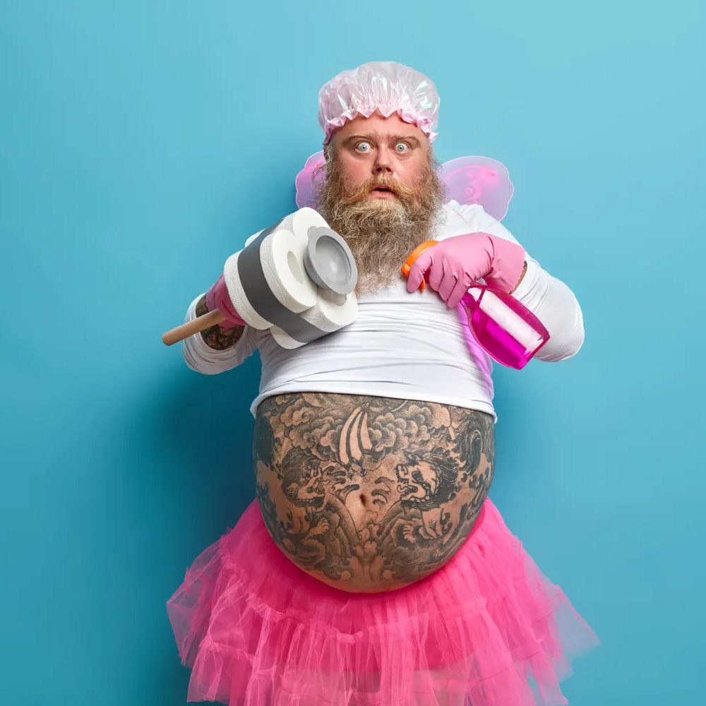
Bearded man in a shower cap, fairy wings, and pink tutu, holding a toilet plunger and spray bottle against a blue background.

How to Sell Badass Products Online

Toilet spray and bidets shouldn't be easy sells online, and Pourri and Tushy prove that's exactly backwards. A look at how "Best Smeller" tags and "Real Pooping Human" review badges turn a taboo category into the most fun you'll have shopping.

Published on Medium - June 2025

  • humor
  • PDP
Continue Reading
Man with a confused expression pointing at his smartphone screen with one finger.

Infinite Scroll vs. Pagination in eCommerce UX: Who Wins the Battle for Conversion?

Infinite scroll feels modern. Pagination converts. A look at why goal-driven shoppers need to backtrack and compare, how Houzz runs both patterns on the same site for different intents, and why ASOS's "Load More" splits the difference without losing SEO.

Published on Medium - June 2025

  • mobile ux
  • PLP
Continue Reading
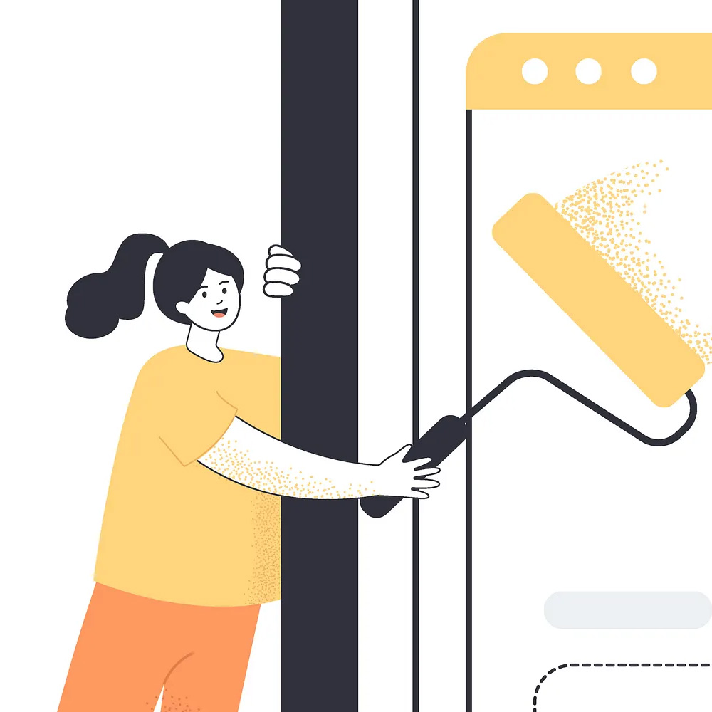
Illustration of a woman using a paint roller to paint a browser window's border yellow, blending into a webpage mockup.

12 Essential Things to Consider When Designing an E-commerce Website

Designers love a name that fits in eight characters and a cart that shows one tidy digit. Reality doesn't. A practical checklist for the questions to ask before design starts, "Hi, Alexander" instead of "Hi, Dan," 88 items in the cart, and the empty states nobody thinks to show you.

Published on Medium - June 2024

  • professional
  • ecommerce design
  • ecommerce ui
Continue Reading